
How to design an intuitive Pie chart (and why most fail)

Pie charts are often described as “simple”, yet few charts are misused as frequently. Their familiarity gives a false sense of safety—anyone can make one, but not everyone makes one that communicates clearly.
Over time, working with charts in presentations and analyses, I’ve noticed something consistent: the effectiveness of a pie chart depends less on the data and more on how it guides human perception. This article brings together verified principles from information design literature, combined with practical layout decisions that I intentionally follow and recommend.
The goal is not to defend pie charts blindly, but to explain when they work, how they should be laid out, and what cognitive assumptions they rely on.
What Pie charts are actually for
A pie chart is designed to answer a narrow but important question:
How is a whole divided, and which parts dominate that whole?
Pie charts are effective when:
- Showing part-to-whole relationships
- Highlighting dominance or contribution
- Communicating approximate proportions, not precise comparisons
They are ineffective when:
- Differences between values are small
- Exact comparison matters
- Many categories are competing for attention
This limitation is well established in the theory of visual variables, most notably in Jacques Bertin’s Semiology of Graphics, where angle and area are classified as perceptually weaker encodings than position or length.
How many slices are too many
A pie chart should ideally contain no more than five or six slices.
This guideline is consistent across respected visualization literature, including Dona M. Wong’s The Wall Street Journal Guide to Information Graphics, which emphasizes clarity through reduction rather than completeness.
On grouping smaller categories into “Others”
Combining smaller categories into an “Others” slice is acceptable—but with a constraint:
- The “Others” slice should not exceed the size of the top two slices
- If it does, the chart fails to communicate hierarchy
At that point, the visualization no longer answers the core question of dominance, and a bar chart or table would be more appropriate.
Why slice ordering matters more than people realize
The Starting Point: Anchoring the largest slice
The largest slice should begin at the 12 o’clock position and move clockwise.
This is not arbitrary. Readers in most contexts scan visuals from the top, and anchoring the most important category there establishes immediate hierarchy. This convention is reinforced in professional editorial graphics, including those described by Wong.
Counter-clockwise emphasis for the second slice
This is a deliberate choice.
The second-largest slice should start from the top and move anti-clockwise.
This layout creates a strong visual counterbalance to the dominant slice and prevents the chart from feeling visually lopsided. The eye registers the two most important categories immediately, without needing to search.
Continuation in anti-clockwise order
All remaining slices should follow the second slice in an anti-clockwise direction.
While many guidelines recommend simple clockwise ordering, this approach emphasizes a clear visual ranking clustered on one side of the chart. The reader encounters the most important information first, then progressively less significant details, without oscillation.
This is not a universal rule—but it is a consistent, intentional system, and consistency is more important than convention alone.
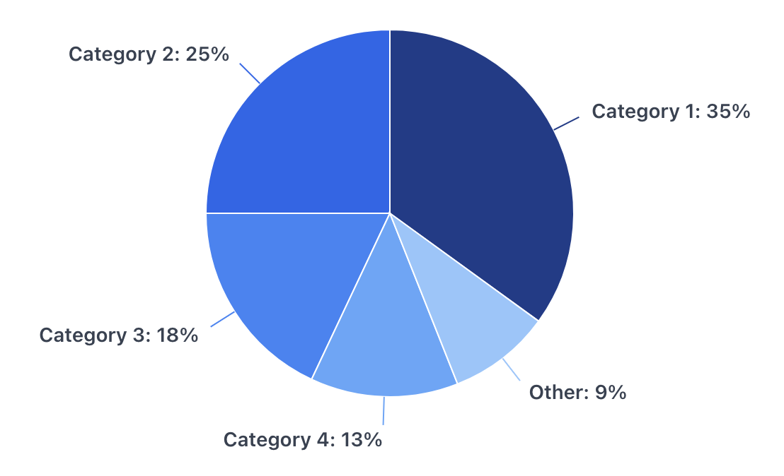
The chart below applies all the principles discussed so far—anchoring the dominant category at the top, using directional ordering to reinforce hierarchy, and keeping visual noise to a minimum.
Color: Hierarchy over Decoration
The most readable pie charts rely on shades of a single color, not multiple unrelated hues.
- The darkest shade should represent the largest slice
- Progressively lighter shades represent smaller slices
This approach aligns with Bertin’s discussion of retinal variables and with Cole Nussbaumer Knaflic’s Storytelling With Data, which stresses visual hierarchy over visual variety.
Using many colors:
- Introduces unnecessary cognitive load
- Suggests categorical differences where none exist
- Competes with the actual message of proportion
When color can Be used for emphasis
If one slice needs to stand out to support the narrative, it may be:
- Given a contrasting color
- Outlined subtly
- Slightly separated (“exploded”) from the pie
This should be done once, and only when it serves the story. Emphasis is meaningful only when it is rare.
Labels, not Legends
Legends force the reader to move their eyes back and forth. Direct labelling—inside the slice or just outside with leader lines—reduces effort and improves comprehension.
Whenever possible:
- Use percentages, not raw numbers
- Keep labels concise
- Avoid overlapping text
Flat, not Fancy
Three-dimensional pies, gradients, shadows, and perspective distort perception. They exaggerate some slices and diminish others, undermining trust.
All three reference works caution against such embellishments. A flat, clean pie chart may look less exciting—but it communicates more honestly.
A simple test before using a Pie chart
Before committing to a pie chart, ask one question:
What is the single most important insight I want the reader to notice first?
If the answer is not immediately visible in a pie chart, then the chart is the wrong choice.
Pie charts succeed when they make the main insight obvious at a glance—and disappear once they’ve done their job.
Resources You’ll Love:
– “Wall Street Journal Guide to Information Graphics: The Dos and Don’ts of Presenting Data, Facts, and Figures” by Dona M. Wong
– “Storytelling With Data: A Data Visualization Guide For Business Professionals” by Cole Nussbaumer Knaflic
– “Semiology of Graphics” by Jacques Bertins