
A Practical Formula for Choosing the Right Data Visualization & Visual Encoding Channels

In many product and engineering teams, dashboards and charts evolve organically. New metrics get added, new charts appear, and visual elements accumulate over time. Eventually, the visuals start feeling inconsistent — not because anyone did something “wrong,” but because there wasn’t a shared decision-making framework to guide how charts and visual encoding channels should be chosen.
Data visualization is not just about picking a chart. It’s a sequence of choices that map data → meaning → visuals.
Once teams understand this sequence, the quality and clarity of dashboards improve dramatically.
This post introduces a simple, trainable framework that designers and engineers can use to consistently choose:
- Which chart type to use, and
- Which visual encoding channels best represent the data
It turns intuition into a repeatable method.
The Core Idea: Visualizations Are Built in Three Decisions
Every data visualization, simple or complex, comes down to three ordered decisions:
Data → Chart → Encoding (D → C → E)
This structure helps us think clearly about what the visualization needs to achieve before deciding how it looks.
Let’s walk through each step.
1. D — Start With the Data Type
Before choosing a chart, identify what kind of data you’re visualizing. This single step eliminates half the confusion.
| Data Type | Examples | Questions It Answers |
|---|---|---|
| Categorical | Country, plan type, segment | “Which group does this belong to?” |
| Ordinal | Priority, rating, stage | “How does this rank or progress?” |
| Quantitative | Revenue, count, duration | “How much or how many?” |
| Temporal | Dates, months, quarters | “How does this change over time?” |
| Geospatial | Latitude/longitude, regions | “Where is this happening?” |
Once the data type is clear, chart choices instantly become narrower and more purposeful.
2. C — Choose the Chart Based on the Analytical Purpose
Each chart answers a specific kind of question. A structured way to think about this is:
| Analytical Intent | Best Chart Types |
|---|---|
| Compare values | Bar, Column, Line (if time-based) |
| Show trends | Line, Area |
| Show distribution | Histogram, Box Plot |
| Show relationships | Scatter, Bubble (with care) |
| Show composition | Stacked Bar, Treemap |
| Show ranking | Sorted bars |
| Show change over time | Line charts |
This step aligns chart choice with analytical intent rather than aesthetic preference.
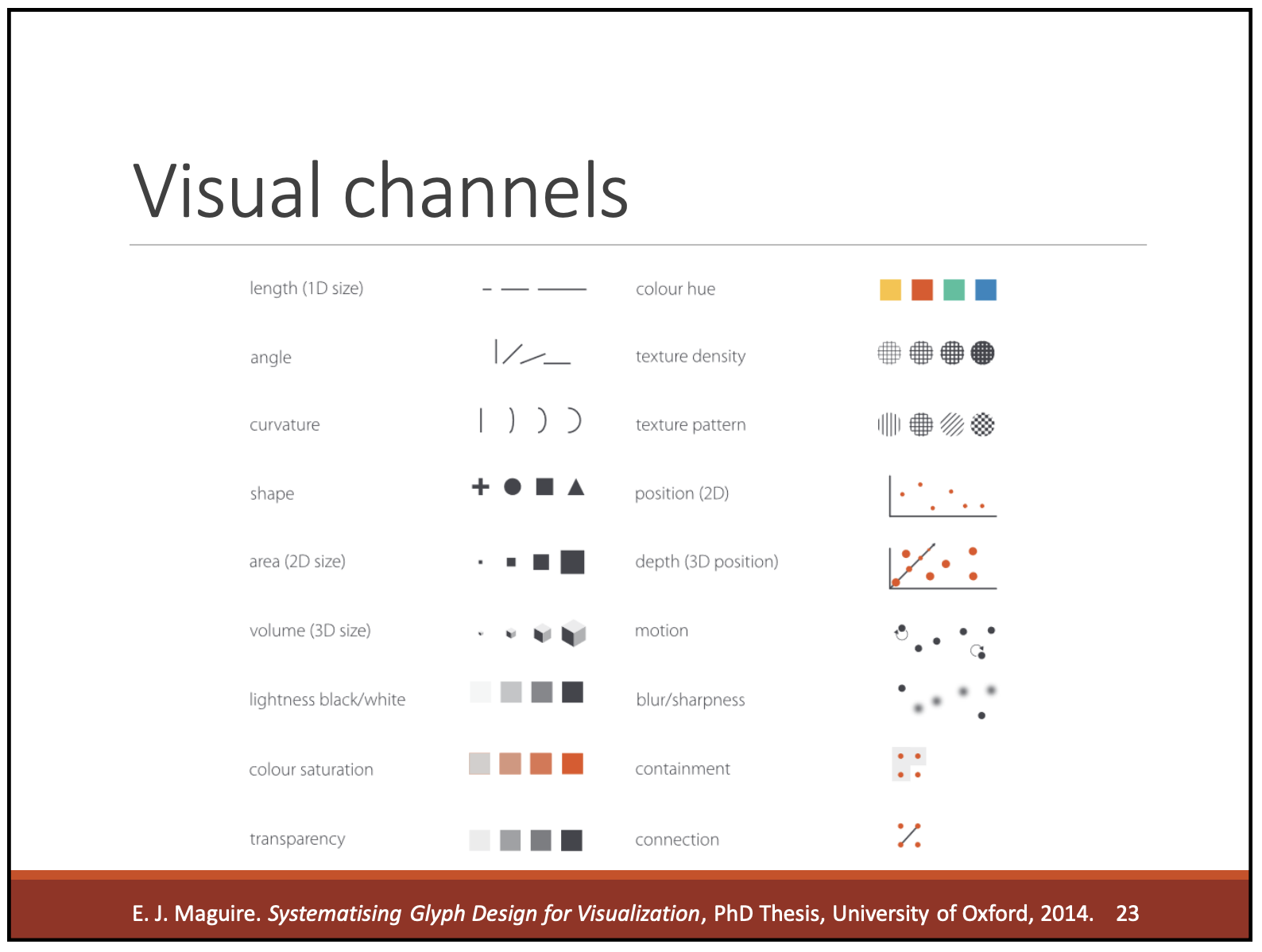
3. E — Map Data to the Right Visual Encoding Channels
Visual encoding channels are the building blocks of every chart: position, color, size, shape, texture, angle, etc.
The key idea is: Match precise data to precise visual channels.
Different channels have different strengths. Below is the table to guide the decision:
| Visual Channel | Strength | Best For |
|---|---|---|
| Position | Very high precision | Trends, comparisons, exact values |
| Length | High | Bars |
| Angle | Medium | Pies (limited use) |
| Area | Low precision | Treemaps, bubbles |
| Color Hue | Category differentiation | Grouping, segmentation |
| Color Brightness / Saturation | Ordered magnitude (approx.) | Heatmaps |
| Shape | Low precision | Distinguishing categories |
| Texture / Pattern | Accessibility | Print, color-blind scenarios |
| Opacity | Density | Overlapping scatter points |
This step is a guide to make consistent, thoughtful encoding choices that enhance readability rather than relying on stylistic decisions.
A Combined Framework (Can be used immediately)
Here’s a practical decision matrix that brings all three steps together:
| Data Type → | Chart → | Encoding Channels to Use | Channels to Avoid |
|---|---|---|---|
| Quantitative | Line, Scatter, Bar | Position, length, brightness | Hue, shape |
| Ordinal | Ordered bar, heatmap | Position, brightness, size | Hue-only |
| Categorical | Bar, grouped bars | Hue, shape | Size, brightness |
| Temporal | Line chart | Position on x-axis | Purely color-based encodings |
| Geospatial | Maps | Color, size, position | Overly complex patterns |
This acts as a playbook for designers and engineers to align on decisions quickly.
How This Framework Helps
This framework shifts the focus from “which chart should we pick?” to
“what question are we answering and which encoding best communicates it?”
It helps to:
- Make consistent visualization decisions
- Reduce guesswork
- Improve clarity and accuracy
- Build dashboards that scale and remain readable
- Train new designers and engineers quickly
- Document visualization rules for design systems
It turns design intuition into a repeatable method that anyone can follow.
Conclusion: Visualization Improves With Shared Decision-Making
Great data visualizations don’t rely on individual taste. They rely on a shared method for choosing:
The chart → The meaning → The visual encoding
By applying the D → C → E framework, create visuals that are easier to read, easier to compare, and easier to maintain — regardless of who builds them.
Resources You’ll Love:
– “Wall Street Journal Guide to Information Graphics: The Dos and Don’ts of Presenting Data, Facts, and Figures” by Dona M. Wong
– “Storytelling With Data: A Data Visualization Guide For Business Professionals” by Cole Nussbaumer Knaflic
– “Semiology of Graphics” by Jacques Bertins